Teams of every size—from early-stage startups to huge enterprises—often start with two things: a creative idea and a compelling prototype. Those crucial first steps are a big part of why Render celebrates (and hosts) all kinds of experimental apps, with free offerings to get teams up and running.
In honor of that all-important creative spark, today we’re excited to showcase four delightful, sharply designed apps from MIT's annual web.lab competition. Each was built by a team of three or fewer undergrads in just one month, and we're proud to host all of them on Render.
We asked these four winning teams about their technology choices, design challenges, and favorite features. See what they built, and try their finished apps out for yourself!
Hexblend - 1st place
URL
What's Hexblend?
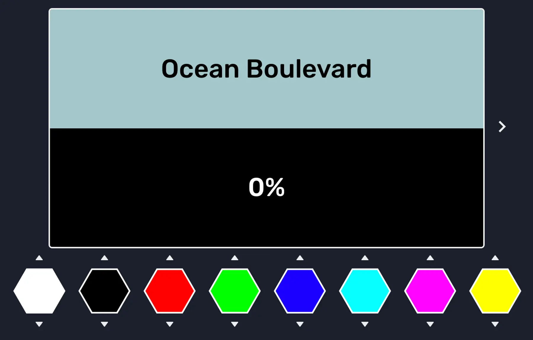
Calling all designers: flex your color-matching skills. Compete against friends to blend your eight starting colors into a target shade. Or train for your next match in the single-player "Zen Mode."
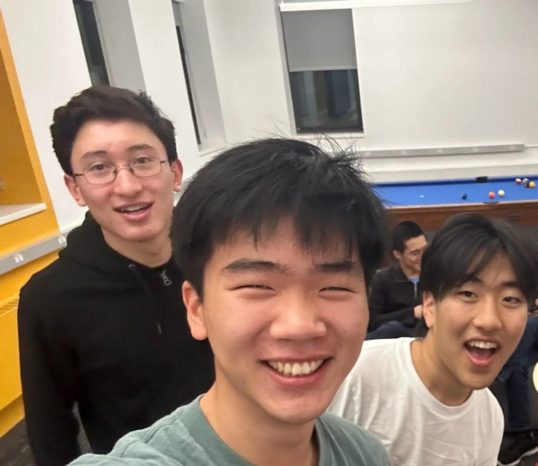
Team
What were your favorite features or design details?
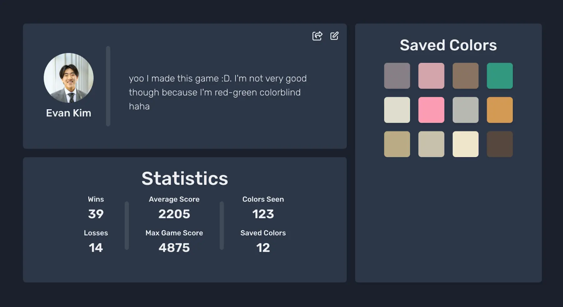
We wanted to highlight one feature and one design detail. Saved Colors is one of our favorite features. If you get a high score in a game (i.e., get your color to most closely match the target color), that color gets saved to your profile page. As you play more, you get more colors on your profile. Adam [team member] has 100 saved colors!
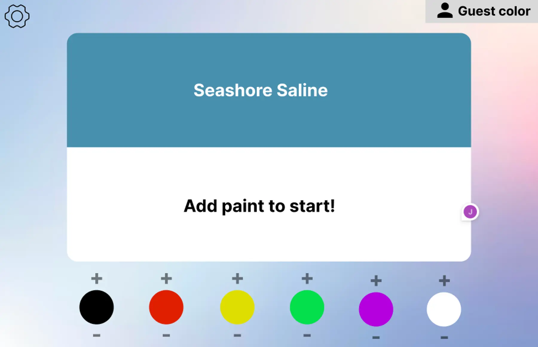
We liked the overall UI design of our game page. Our UI design came a long way from our very first Figma designs: here’s what an early design looked like!
What’s an implementation challenge you faced, and how did you solve it?
We had to figure out how to compute color differences. We tried out many different formulas before landing on the one in the game.
Our goal was to find a formula that best matches what the human eye sees. We first tried the Euclidean distance between the colors in RGB space. But we didn’t like what we saw—literally.
Eventually, we landed on using Euclidean distance in the CIELAB color space. (We did try the more complex CIEDE2000 formula instead of Euclidean distance, and we liked the Euclidean result better.)
Which technologies and frameworks did you use?
We built our app on the MERN stack—MongoDB, Express, React, Node. One interesting library we used was Chakra UI, a React component library. The main app is a single web service running on Render.
Editorial: Render’s favorite design detail
When you create a game “room” in Hexblend, you get a room code to share with other people so they can join.
Each room code is a Hex color code! The Hex color is then used as the color theme in the game lobby.
Maze Craze - 2nd place
URL
https://mazecraze.onrender.com
What's Maze Craze?
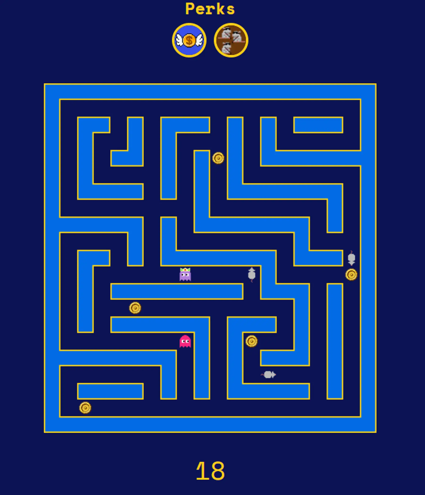
Compete against friends to collect the most coins in this multi-round maze game with twists. Each round, the gameplay grows in complexity as a random “perk” is added: killer mice, crumbling walls, “social distancing”, and more. Use the W, A, S, D keys to move your ghost.
Team
What were your favorite features or design details?
We put a lot of thought into UI design details.
Across our pages, you see a consistent retro-style design that revolves around the idea of being inside, or zoomed-into part of a maze. When you start a game, a fun animation loads. The player box and player chat break apart like the maze door is opening up, and a radiating sprite animates down. This animation acts like a countdown to the start of gameplay.
Inside the game, the current leading player has a crown on their head. The fact that everyone can see this opens up a variety of strategies. Should you continue collecting coins, or divert your attention to stopping the winner?
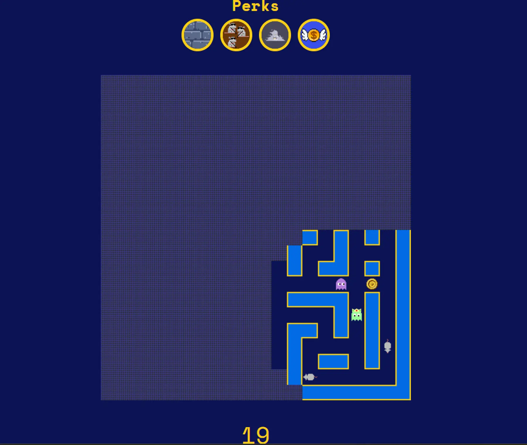
Finally, many of the "perks" affect the UI in interesting ways: like "MazeHaze," which limits your perspective to a limited radius around you.
What’s an implementation challenge you faced, and how did you solve it?
The implementation decision we found most helpful was to keep active game state in memory. We realized, for our current needs, we actually didn’t need to store this state in the database. This comes with tradeoffs, but benefits were simplicity in our code and speed.
In our code, we represented game state as a single object (think: like a JSON object) that stores all the information about a game—including the grid layout, the player locations and stats, and which perks are active in the game. The complete game state is continually sent to each player’s browser.
We do save persistent attributes to the database. These include the historical game stats for each player, and the custom keybindings that each player can choose to set.
Which technologies and frameworks did you use?
We built our app on the MERN stack, and made heavy use of the Socket.io library. For the frontend, one interesting library we used was TailwindCSS. The main app is a single web service running on Render.
Editorial: Render’s favorite design detail
The fact that the game "perks" are random, and accumulate through rounds—this makes each game feel fresh.
Memoia - 3rd place
URL
What's Memoia?
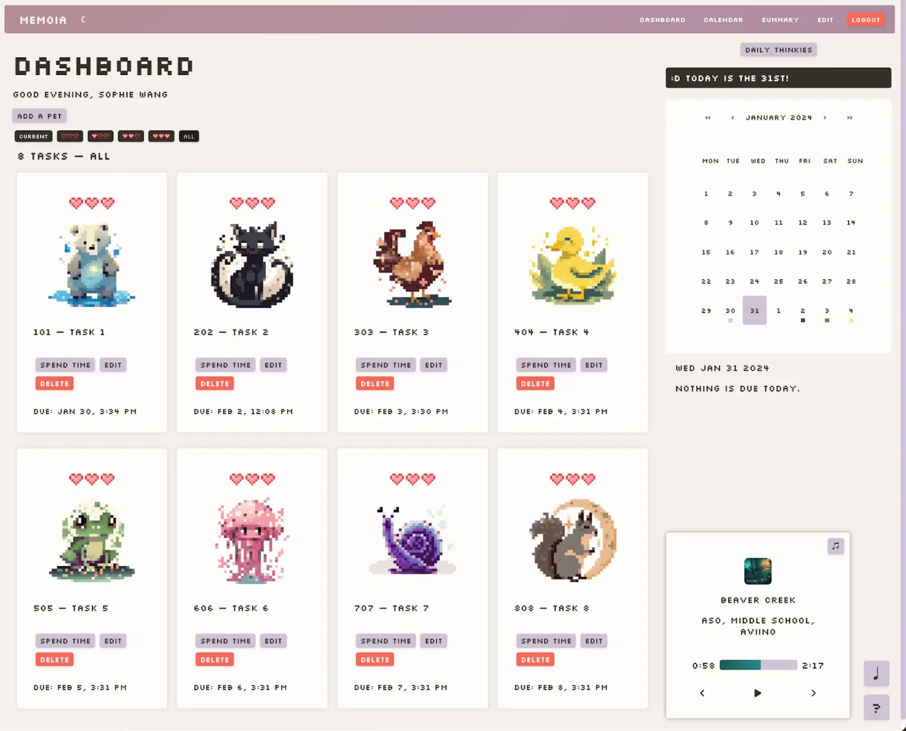
Study in an immersive space with timers and a music player. Turn your tasks into virtual pets, then watch them grow and evolve as you dedicate time toward your goals.
Team
What were your favorite features or design details?
Our favorite design aspect is our original pixel art.
One of our favorite features is the ability to view stats for time spent per week.
What’s an implementation challenge you faced, and how did you solve it?
We had to figure out how to calculate the time spent per week for our “Summary” page, which shows metrics. We ended up precomputing and storing the time spent per task, and per class, in the database. At display time, we aggregated the relevant times and sent the result to the frontend.
Which technologies and frameworks did you use?
We built our app on the MERN stack, and wrote our own CSS. The main app is a single web service running on Render.
Editorial: Render’s favorite design detail
We love the hearts-based loading indicator. 🩷
Purrductive - an honorable mention
URL
https://purrductive.onrender.com
What's Purrductive?
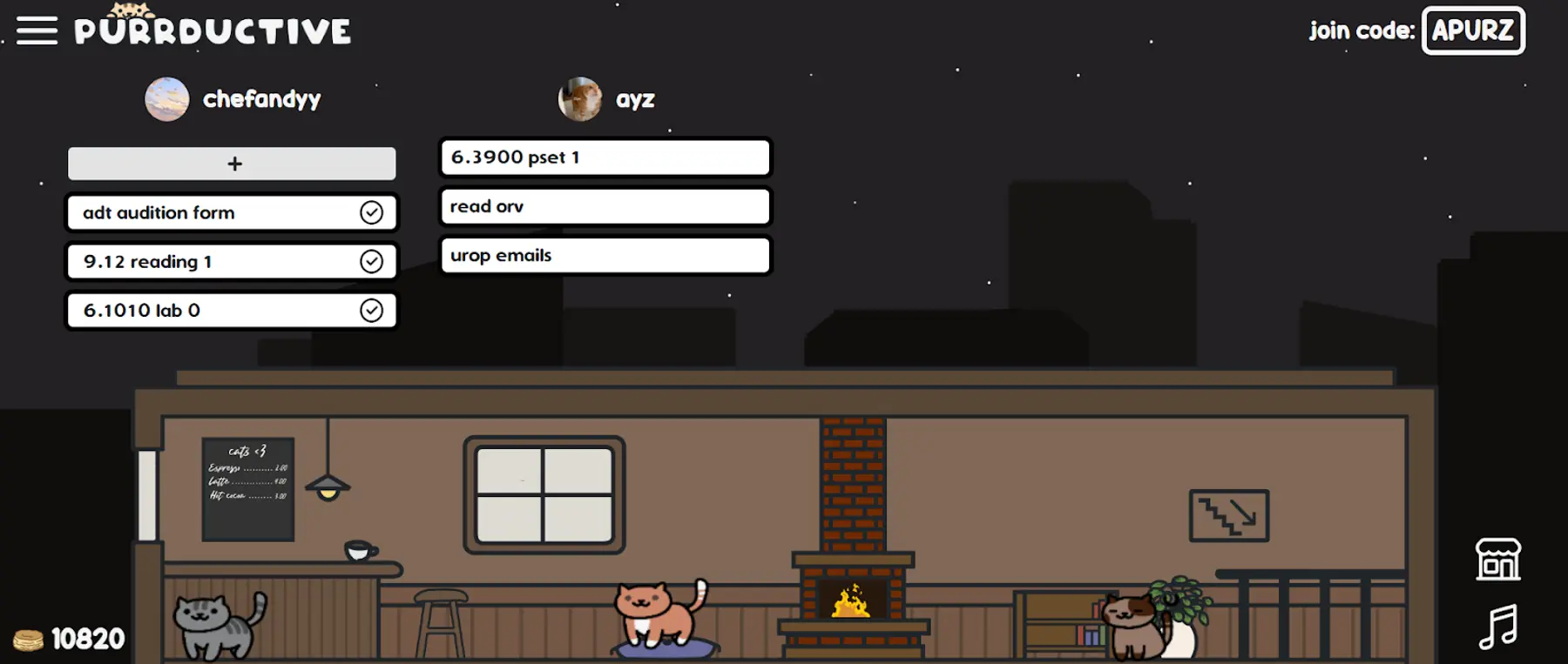
Stay focused during study sessions with your own virtual cat cafe. Add your to-do items, then cross them off to attract more cats. Invite your friends to maximize collaboration and cute fuzzballs.
Team
- Andy Phung (LinkedIn)
What were your favorite features or design details?
Design details are at the heart of this app, since it’s pretty minimal.
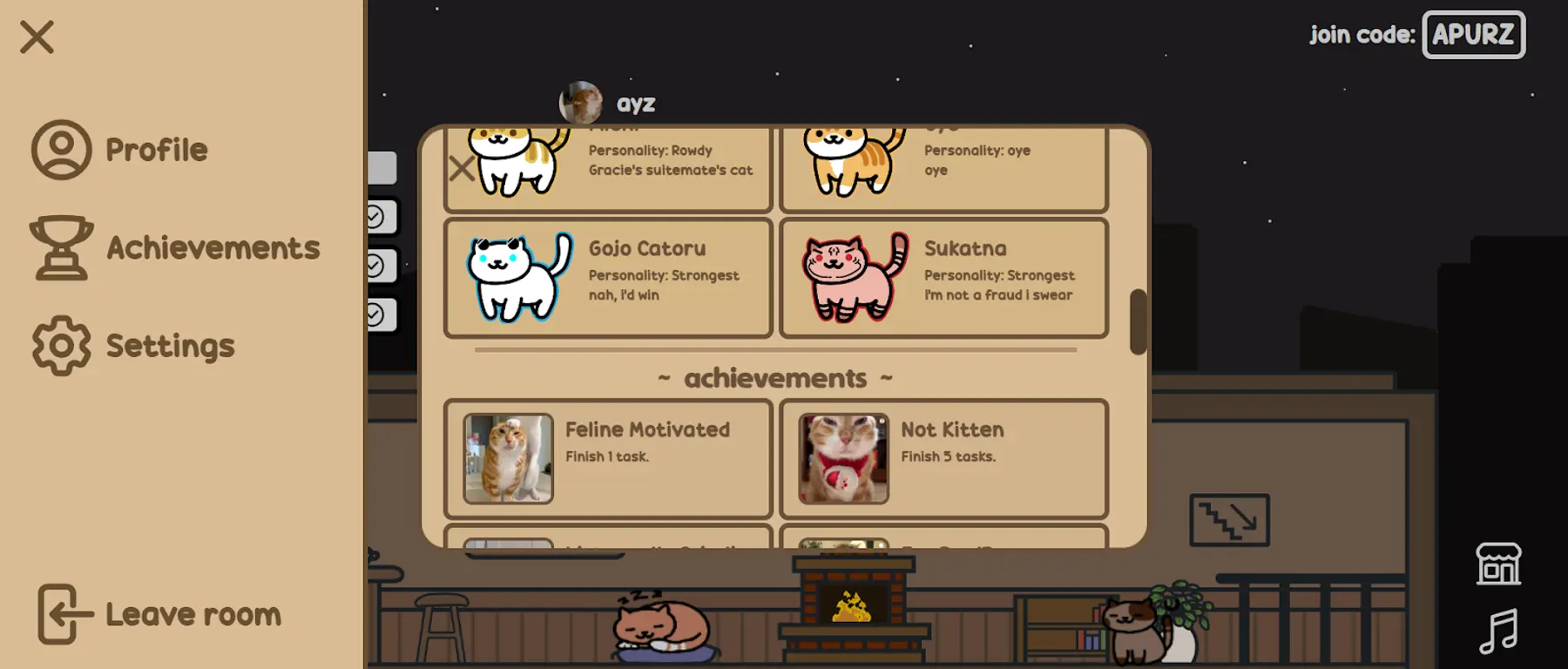
One of my favorite details is that every minute or so, the cats in the cafe change states (from sleeping to standing or sitting). It took a lot of drawing, but it was worth it!
I also really like the cats floating through space on the landing page.
What’s an implementation challenge you faced, and how did you solve it?
I had to deal with how to sync changes to user data to all parts of the UI. For example, if someone edits their name, that information must be updated in every part of the UI that shows their name. I ended up keeping this user data at the highest level React component (<App />), and passing it down to every child component.
Which technologies and frameworks did you use?
I used the MERN stack. The main app is a single web service running on Render. Communication between the front and back end is done through Socket.io. The cats are drawn via HTML Canvas, and user profile pictures are uploaded via the Imgur API.
Editorial: Render’s favorite design detail
That magical moment when new cats appear in your cafe, after you complete tasks.
Congratulations to all the winners and participants
If this post sparked your interest, check out the complete list of winners—including semifinalists and other honorable mentions—on the MIT web.lab site.
Building from sketch to scale
Render helps you deploy your idea fast, and we also help you scale it when the time comes. To see how a larger organization uses Render, check out how Felt ships 15+ times a day with the help of Render preview environments.